How to Build a Smart Link Page That Actually Converts Fans
Executive Summary
Most smart link pages don’t fail because they lack features. They fail because they don’t guide behavior. Fans arrive curious, but the page offers no sense of priority, no implied sequence, and no clear next step. What looks like flexibility to the artist feels like friction to the fan.
A smart link page that actually converts is not designed to present options — it is designed to move attention. Conversion on a smart link page isn’t about clicks or completions; it’s about continuation. Each interaction should make the next action feel natural, safe, and obvious without asking the fan to think about it.
This is why structure matters more than content. Hierarchy, sequencing, and restraint quietly shape how fans behave long before they decide whether to listen, follow, or buy. When structure is intentional, curiosity turns into momentum. When it isn’t, even high-interest traffic stalls.
Building a smart link page that converts means designing for human behavior instead of artistic completeness. The goal is not to show everything a band has, but to guide fans somewhere meaningful — and let that movement compound over time.
Key Takeaways
When fans are asked to decide what matters, attention hesitates and momentum leaks.
A page converts when each action makes the next step feel obvious and safe.
Ordering actions correctly matters more than how many options are available.
Fans decide whether to continue within seconds based on what they see first.
Removing unnecessary decisions allows curiosity to pull fans forward naturally.
The page succeeds when it guides movement, not when it displays everything.
Why Most Smart Link Pages Don’t Convert
Most smart link pages look complete. They have the logo, the bio, the buttons, the embeds. From the artist’s point of view, everything that matters is there. And yet, conversion is weak. Fans arrive, pause, click inconsistently, or leave altogether.
This failure is rarely about traffic quality or interest. It’s about direction.
When fans land on a smart link page, they aren’t looking to explore a catalog. They’re responding to a moment of curiosity sparked somewhere else — a song clip, a video, a post, a recommendation. That curiosity is fragile. It needs guidance, not freedom.
The most common mistake bands make is equating options with value. By trying to show everything at once, the page asks the fan to decide what matters. Listen or watch? Follow or browse? New song or old favorite? Each decision adds friction. Instead of feeling invited forward, the fan feels stalled.
This creates what looks like engagement on the surface — a few scattered clicks — but no momentum underneath. The page functions as a directory, not a journey. Nothing suggests priority. Nothing implies sequence. Everything competes, and when everything competes, nothing wins.
What makes this especially deceptive is that the page technically “works.” Links load. Buttons respond. Analytics show visits. But conversion fails quietly, because the problem isn’t visibility — it’s hesitation. Fans don’t reject the page; they simply don’t continue.
Smart link pages convert when they do one thing exceptionally well: they remove the need to decide. They replace choice with direction and ambiguity with flow. When that structure is missing, even highly motivated fans hesitate — and hesitation is where momentum dies.
Understanding this is the foundation for everything that follows. Conversion doesn’t start with better design or more features. It starts by recognizing that structure, not content, determines whether attention moves forward or disappears.
What “Conversion” Actually Means on a Smart Link Page
Most musicians think of conversion as a finish line. A stream counted. A follow added. A ticket purchased. Those outcomes matter — but on a smart link page, they’re downstream effects, not the definition of success.
Conversion here means continuation.
A fan arrives with curiosity, not commitment. They didn’t come to complete a task; they came to see if the moment that caught their attention is worth more of it. A smart link page converts when it quietly answers that question and makes the next step feel like a natural extension of the first click.
This is why click-through rates alone are misleading. A page can generate clicks without building momentum. Fans bounce between options, sample briefly, and disappear. Nothing accumulates. Nothing compounds. The page technically performs, but the journey stalls.
Real conversion happens when each interaction lowers resistance instead of raising it. Listening leads naturally to context. Context leads to deeper engagement. Deeper engagement opens the door to follow, subscribe, or show up later. The page doesn’t push fans forward — it removes the reasons they might stop.
This reframing is critical because it changes how pages are designed. If the goal is completion, you optimize for buttons and calls to action. If the goal is continuation, you optimize for sequencing, emphasis, and trust. The page becomes less about urging action and more about sustaining motion.
This idea is explored further in Smart Links for Musicians: How to Turn One Link into a Marketing Powerhouse, where smart links are positioned not as destinations, but as engines that keep fan attention moving forward.
Once conversion is understood this way, the rest of the structure falls into place. You stop asking how to get fans to click more, and start asking how to make each click matter more than the last.
Conversion Is About Sequence, Not Volume
Most smart link pages are built on an instinct that feels logical but fails in practice: if you give fans more options, more of them will convert. In reality, the opposite happens. Volume dilutes direction.
Fans don’t arrive ready to evaluate everything a band offers. They arrive mid-emotion, mid-impulse, with limited attention and no desire to plan their own journey. When a page presents ten equally weighted links, it creates work. The fan must decide what matters first — and hesitation replaces motion.
Sequence removes that burden.
A converting smart link page establishes order. It signals what to do now, not everything that could be done eventually. The first action anchors attention. The second action deepens context. Each step earns the next. When order is clear, fans don’t feel pushed — they feel guided.
This is why pages with fewer visible options often outperform pages packed with content. It isn’t minimalism for its own sake. It’s prioritization. The page communicates, without explanation, “start here.” That single cue does more for conversion than any call-to-action copy ever could.
What’s often missed is that sequence also preserves narrative. Music leads to meaning. Meaning leads to identity. Identity leads to commitment. When links are ordered randomly, that story collapses. When they’re sequenced intentionally, momentum feels inevitable.
This shift from volume to sequence reflects a broader change in how bands build audiences today. As explored in How Smart Links Are Changing the Way Bands Build Their Fanbase, growth no longer comes from scattering attention across platforms, but from shaping how attention moves once it arrives.
Conversion doesn’t improve when you add more doors. It improves when you clearly show which door to walk through first.
The Above-the-Fold Decision (The Make-or-Break Moment)
Fans decide whether to stay on a smart link page far faster than most artists expect. Within a few seconds — often before any scrolling happens — they make a judgment: Is this worth my attention right now?
That decision is made above the fold.
What appears first on a smart link page does more than introduce the band. It establishes intent. It tells the fan whether the page knows what it’s for, whether it feels guided or scattered, and whether continuing will be effortless or mentally taxing. If that first impression feels cluttered or undecided, the rest of the page rarely gets a chance.
The most common mistake is treating above-the-fold space as a summary. Logos, bios, multiple buttons, embeds, icons — all competing for attention at once. Nothing leads, so everything competes. The fan scans, pauses, and leaves.
A converting page uses above-the-fold space to answer three silent questions immediately:
Why am I here?
The page reflects the context that brought the fan in.What should I do first?
One primary action is visually unmistakable.Is it safe to continue?
The page feels calm, intentional, and trustworthy.
When those questions are answered without explanation, curiosity carries the fan downward. They don’t need to understand the whole page — only what makes sense right now.
Above-the-fold structure also signals confidence. Pages that know what matters feel composed. Pages that try to prove everything feel anxious. Fans respond to that difference instinctively. Calm structure builds trust; busy structure raises doubt.
This behavior isn’t subjective. It’s rooted in how visual hierarchy and attention actually work. The psychology behind these split-second decisions is explored further in Smart Link Design Psychology: How Layout Impacts Fan Behavior, where layout choices directly influence whether fans stay, scroll, or bounce.
Above-the-fold space isn’t about aesthetics. It’s about permission. When the page clearly tells fans where to begin, they’re far more likely to continue — and continuation is where conversion actually starts.
How Visual Hierarchy Shapes Fan Behavior
Fans don’t read smart link pages — they interpret them. Before a word is processed, the page has already communicated what matters, what can be ignored, and whether continuing feels easy or demanding.
That communication happens through visual hierarchy.
Hierarchy is how a page answers an unspoken question: What deserves my attention first? Size, spacing, contrast, and placement all work together to create an order of importance. When that order is clear, fans move naturally. When it isn’t, attention scatters.
The biggest mistake bands make here is treating all actions as equally important. Equal-sized buttons, evenly spaced sections, uniform colors — everything looks fair, but nothing leads. Equality feels neutral, yet neutrality is the enemy of momentum. Fans don’t want to evaluate; they want to follow.
A converting page uses hierarchy to remove ambiguity. It makes one action feel primary, a few actions feel secondary, and everything else feel safely optional. This doesn’t limit choice — it delays it until the fan is ready.
Well-designed hierarchy quietly communicates:
What matters now
One element clearly dominates visual attention.What can wait
Secondary actions are visible but subdued.What’s supporting context
Information is present without demanding focus.
Spacing plays a crucial role here. Crowded pages create urgency without direction, which feels stressful. Generous spacing, on the other hand, slows the eye and signals confidence. Fans are more willing to engage when the page doesn’t feel like it’s asking for everything at once.
Contrast matters just as much. When every element is bold, nothing is. When emphasis is used sparingly, it becomes meaningful. The page teaches the fan how to move simply by where it asks them to look.
This isn’t about design taste or branding trends. It’s about how attention actually works. As explored in Smart Link Design Psychology: How Layout Impacts Fan Behavior, visual hierarchy directly influences whether fans scroll, hesitate, or leave — often before they’re consciously aware of making a choice.
A smart link page converts when hierarchy does the thinking for the fan. When the page decides what matters, the fan doesn’t have to — and that relief is what keeps momentum alive.
Reducing Friction Without Killing Depth
Most smart link pages lose fans not because they ask too much — but because they ask too often. Every extra decision, every unclear option, every moment of “what should I do now?” adds friction. And friction doesn’t slow fans down politely. It stops them.
The instinctive response is to simplify aggressively. Fewer links. Less content. Minimal everything. But taken too far, simplification creates a different problem: shallowness. Fans move quickly, but there’s nowhere meaningful to go.
The goal isn’t less depth. It’s less cognitive load.
A converting smart link page reduces friction by separating what’s immediately relevant from what’s available when needed. The page feels simple at first glance, but reveals depth as attention grows. Fans aren’t overwhelmed — they’re invited.
Friction usually shows up in predictable ways:
Too many decisions at once
When multiple actions compete for attention, none of them feel safe to choose.Unclear consequences
Fans hesitate when they don’t know what happens after a click.Contextless options
Links without framing feel risky, even if the content is strong.
Reducing friction doesn’t mean removing options; it means sequencing them. Primary actions are obvious. Secondary actions are present but quiet. Deeper content exists, but it waits its turn.
This is where smart link pages quietly outperform traditional link lists. Instead of flattening everything into a single moment, they create layers. Fans engage at their own pace, without being forced to decide how deep to go upfront.
This layered approach mirrors how effective fan funnels work across platforms. As explored in Music Links for Artists: Build a Better Fan Funnel, momentum increases when each step feels easier than the last, not heavier.
When friction is reduced correctly, depth stops feeling intimidating. Fans don’t feel rushed or sold to. They feel guided. And guidance — not pressure — is what keeps attention moving forward.
Designing for Continuation, Not Completion
Many smart link pages unintentionally signal that the visit is supposed to end.
This happens in subtle ways. Language that emphasizes finality. Layouts that collapse once an action is taken. Pages that feel like a checklist rather than a place. Even when nothing is explicitly “closed,” the structure communicates that the job is done.
Fans pick up on that instantly.
Completion-focused pages are built around outcomes: follow here, stream this, buy that. The problem isn’t the actions themselves — it’s the implied finality. When a page feels like it’s asking the fan to decide, commit, or finish something, attention tightens. Fans either comply quickly or disengage altogether.
Continuation-focused pages send a different signal. They imply that engagement is ongoing, optional, and safe. Nothing feels urgent. Nothing feels gated. The page doesn’t rush the fan toward an outcome — it leaves the door open.
This difference shows up structurally:
Completion pages collapse after action
Once a button is clicked, the experience feels resolved.Continuation pages remain explorable
After any interaction, the page still feels alive and relevant.Completion pages emphasize endpoints
Language and layout suggest a finish line.Continuation pages emphasize presence
The page feels like a place to return to, not a task to complete.
What makes this distinction powerful is that it doesn’t rely on persuasion. Fans don’t feel pushed, convinced, or marketed to. They feel unpressured — and unpressured attention lasts longer.
Designing for continuation means resisting the urge to “close the loop.” Not every visit needs to resolve something. Some visits are about recognition. Others are about familiarity. Others are about trust building quietly in the background.
A smart link page converts best when it doesn’t feel like it’s trying to convert at all. When the page feels ongoing rather than transactional, fans are far more likely to come back — and return visits are where momentum actually compounds.
What to Exclude on Purpose (And Why This Increases Trust)
One of the hardest parts of building a smart link page that converts is deciding what not to show.
For artists, exclusion feels risky. Every song, every video, every platform represents effort, identity, and pride. Leaving something out can feel like hiding value. But for fans, restraint signals something very different: confidence.
Pages that try to show everything immediately feel uncertain. They read like they’re asking for validation — please notice all of this. Pages that exclude intentionally feel composed. They imply that the artist knows what matters, and that the rest will still be there when the time is right.
Trust grows in that gap.
Exclusion works because it reduces psychological noise. When fans aren’t confronted with a full inventory of options, they don’t feel pressured to evaluate. Instead, they feel guided. The page communicates, without saying it, “You don’t need to figure this out. Start here.”
What often needs to be excluded isn’t weak content — it’s premature content.
Early in the journey, fans don’t need:
- Every platform you’re on
- Your full back catalog
- Multiple competing calls to action
- Dense bios or explanations
They need orientation. They need to understand who you are right now and why continuing makes sense.
Exclusion also builds anticipation. When something isn’t immediately visible, it gains weight. Fans who move deeper feel like they’re discovering rather than being sold to. That feeling of discovery is one of the most underutilized drivers of engagement on artist pages.
Importantly, exclusion is not removal. It’s sequencing. Content isn’t deleted — it’s delayed until attention is ready for it. When fans encounter depth after momentum is established, they engage with it differently. What felt overwhelming at the start now feels earned.
Smart link pages that convert don’t feel empty. They feel intentional. And intention is what transforms curiosity into trust.
By choosing what to exclude, a band isn’t limiting itself. It’s shaping the experience — and shaping the experience is what makes continuation possible.
Context Matters: Matching the Page to Why the Fan Arrived
Not every fan arrives at a smart link page for the same reason — and pages that treat them as if they did quietly underperform.
Some fans arrive from a new single. Others come from a tour post, a video clip, a QR code on a flyer, or a recommendation from a friend. Each entry point carries different intent. When the page ignores that context and presents a one-size-fits-all experience, it forces fans to re-orient themselves before they can move forward. Many won’t bother.
Context-aware pages remove that friction.
The most effective smart link pages feel relevant immediately because they acknowledge why the fan is there. A release-driven visit should feel anchored in listening. A tour-driven visit should surface dates and location cues early. Discovery traffic needs orientation before commitment. The page doesn’t need to explain this — it just needs to reflect it.
Problems arise when pages flatten intent:
- Release traffic is greeted with generic bios and unrelated links
- Tour traffic has to search for dates
- Video traffic lands on pages that don’t acknowledge the visual context
- Offline traffic arrives without narrative grounding
In each case, the fan has to do interpretive work the page should have done for them.
Context-aware design doesn’t require multiple pages. It requires thoughtful prioritization. The same destination can adapt by changing what leads, what follows, and what waits. When structure aligns with intent, fans feel understood — and understood fans continue.
This principle becomes especially important during campaign moments, where traffic spikes briefly and expectations are high. As explored in How to Use Smart Links to Promote New Releases Like a Pro, performance improves when smart links are aligned to the moment that sent the fan there, rather than treated as static destinations.
When a smart link page matches entry context, it stops feeling generic. It feels responsive. And responsiveness is what turns a single click into a meaningful interaction instead of a missed opportunity.
When a Smart Link Page Becomes Part of a Larger System
A smart link page reaches its full potential when it stops being treated as a standalone page and starts functioning as part of a system. On its own, a well-structured page improves continuation. Inside a larger strategy, it becomes infrastructure.
This is where many bands stall. They build a solid page, see modest improvements, and stop there. But the real gains appear when the page is allowed to persist, evolve, and connect across moments — releases, tours, videos, and offline touchpoints — without breaking familiarity.
In a system, the smart link page does three things at once:
It stays recognizable
Fans learn where to go. The destination becomes habitual, not novel.It adapts without resetting
What leads can change based on the moment, but the page still feels like the same place.It accumulates context over time
Each visit builds on the last instead of starting from zero.
This is the difference between promotion and leverage. Promotion pushes attention toward an outcome. Leverage captures attention and makes it reusable. When the page is part of a system, every campaign strengthens the next one instead of competing with it.
This is why smart link pages should never be designed in isolation from strategy. As outlined in Why Every Indie Band Needs a Smart Link Strategy, links aren’t just destinations — they’re control points in the fan journey. Treating them as infrastructure changes how growth compounds.
The same principle applies to branding. When a smart link page is consistent, intentional, and trusted, it becomes an extension of identity rather than a temporary landing page. Fans associate the destination with the band itself, not with a campaign or platform. That shift is explored further in Beyond the Bio Link: How Smart Links Are Changing Artist Branding Forever, where links act as stable brand surfaces instead of disposable utilities.
At this stage, the page stops feeling like something you send people to. It becomes the place everything leads into. Releases don’t replace each other. Tours don’t interrupt momentum. Videos don’t fragment identity. Everything resolves to the same system, strengthening it each time.
A smart link page that converts is valuable. A smart link page that operates as part of a system is transformative. That’s where momentum stops being fragile — and starts compounding quietly in the background.
Common Conversion Myths That Hurt Smart Link Pages
Even when bands understand the mechanics of smart link pages, a few persistent myths quietly undermine conversion. These ideas sound reasonable, but they lead pages in the wrong direction — especially as traffic grows.
Myth #1: More links mean more opportunity
This assumes fans arrive ready to evaluate options. They don’t. Opportunity only exists when attention is guided. When everything is visible at once, the page creates possibility at the expense of momentum — and momentum is what converts.
Myth #2: Fans want to choose for themselves
Fans want clarity, not control. Choice feels empowering only when context is clear. Without guidance, choice becomes labor. Smart link pages convert by deciding what matters first, not by delegating that decision to the visitor.
Myth #3: Strong calls to action increase conversion
Aggressive CTAs often do the opposite. They signal urgency before trust is established. On a smart link page, the strongest call to action is structural — the page itself quietly suggests what makes sense next.
Myth #4: Design is subjective
Taste is subjective. Behavior isn’t. Visual hierarchy, spacing, and emphasis reliably shape how attention moves, regardless of genre or aesthetic. Pages that ignore this mistake preference for performance.
Myth #5: Conversion should happen on the first visit
This mindset pressures pages into premature outcomes. Many visits are about orientation, recognition, or familiarity. Conversion improves when pages allow return visits to matter instead of forcing resolution immediately.
Myth #6: Simplifying means removing value
Simplification isn’t subtraction — it’s sequencing. Value isn’t lost when content is delayed. It’s often experienced more deeply once momentum exists.
These myths persist because their failures are quiet. A page still gets traffic. Fans still click occasionally. Nothing visibly breaks. But growth stalls because attention never stacks.
Smart link pages that convert reject these myths and design for how fans actually behave — not how artists hope they will.
Frequently Asked Questions
What does “conversion” mean on a smart link page?
Conversion on a smart link page isn’t about finishing an action — it’s about continuation. A page converts when it makes the next step feel natural, safe, and obvious, keeping attention in motion rather than forcing commitment too early.
How is a smart link page different from a traditional link-in-bio page?
A link-in-bio page lists destinations. A smart link page guides behavior. It uses structure, hierarchy, and sequencing to shape what happens after the click instead of leaving outcomes to chance.
How many links should a smart link page have to convert well?
There’s no ideal number. What matters is order and emphasis. A converting page makes one action clearly primary, a few actions secondary, and delays everything else until attention is ready for it.
Why do equal-sized buttons hurt conversion?
When everything looks equally important, nothing leads. Equal visual weight forces fans to decide what matters, which increases hesitation and reduces momentum.
Can a smart link page still convert if fans leave without clicking anything?
Yes. Not every visit should resolve immediately. Orientation and familiarity are part of the conversion process. Fans who leave with curiosity intact are far more likely to return and engage later.
Should smart link pages change for releases, tours, or videos?
They should adapt, not reset. The destination should stay familiar while what leads reflects the context that brought the fan there. Consistency builds trust; relevance drives continuation.
Does simplifying a smart link page mean removing important content?
No. Simplification is about sequencing, not deletion. Depth still exists — it’s just revealed when attention is ready for it instead of being forced upfront.
Do smart link pages replace artist websites?
Not necessarily. For many artists, smart link pages act as focused, behavior-driven hubs, while websites serve broader archival or informational roles. The two can complement each other.
What’s the biggest mistake bands make with smart link pages?
Designing for completeness instead of movement. Pages that try to show everything immediately often stall attention instead of guiding it forward.
Built for Musicians. Powered by Smart Links.
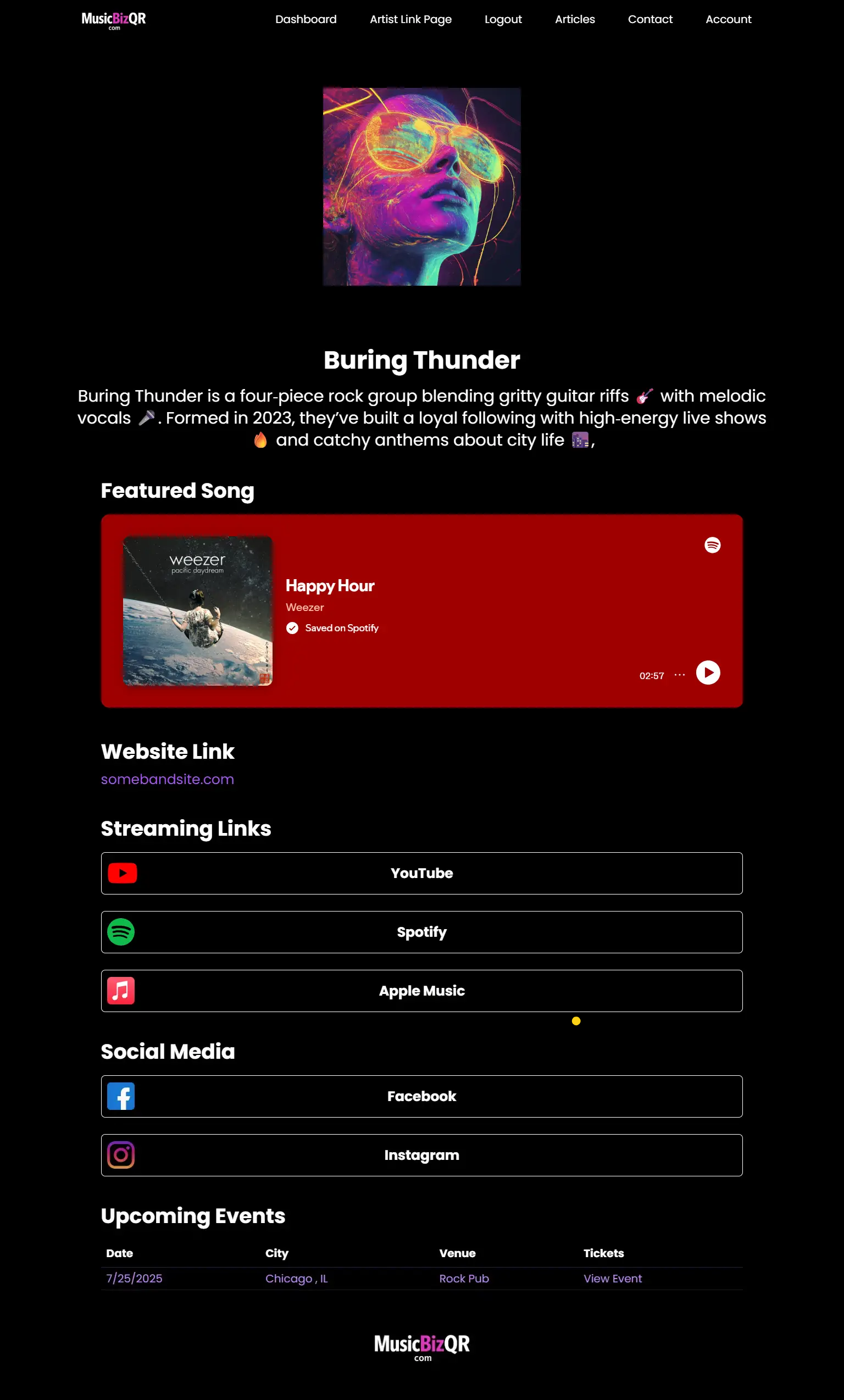
MusicBizQR gives you a powerful landing page with streaming links, videos, social buttons, and real-time fan analytics — all from a single QR code.
- 🎯 Unlimited link clicks & analytics
- 📈 Track Spotify streams, YouTube plays, and QR scans
- 📱 Mobile-optimized artist pages
- 🚀 Create your first Smart Link in seconds
Related Posts
Most link-in-bio tools weren’t built for musicians. Discover why smart links create better fan journeys, stronger branding, and higher conversions for your music.
Smart links for musicians explained—how they work, why they matter in 2026, and how to build a fan-converting link that drives your music career.
Discover how music links can help artists guide fans across platforms effortlessly. Learn strategies to boost engagement, streams, and merch sales.
Most link-in-bio tools weren’t designed for musicians. Learn why smart links deliver better fan engagement, stronger branding, and real music-driven revenue.
Smart links aren’t just utility tools — they’re the new frontier in artist branding. Learn how visual design, consistency, and fan-centric smart links define a musician’s digital identity.
Discover how smart links can transform fleeting music streams into lasting fan connections. Learn the strategies indie artists use to grow their audience in the streaming era.
Discover how smart links empower indie artists to create deeper, lasting relationships with fans. Turn every click into meaningful engagement.
Discover 2026’s best smart link tools for artists. We compare top platforms, fan engagement features, and why MusicBizQR stands above the rest.
Learn how direct-to-fan video turns your smart link into a conversion machine. Build trust, drive streams, and make real fan connections with MusicBizQR.
Learn how to use music links to drive fan engagement, increase streams, and promote your music like a pro. Built for modern artists and bands. Shall I begin writing the Markdown content for this article now?
In 2026, discovery is chaotic — and smart links are how artists bring it all together. Explore how music smart links guide fans, boost streams, and create real momentum across every platform.
Tired of generic link tools? Discover the smart link platform built for music: video previews, analytics, and full artist control—all in one sleek page.
Every new release deserves more than a link in your bio. Learn how to use smart links to drive streams, collect fans, and turn a single drop into lasting momentum.
The layout of your smart link page can make or break your fan engagement. Learn the design psychology that turns clicks into superfans.
If you're still sending fans to scattered links, you're leaving money on the table. Here's why every indie artist needs a smart link strategy to grow, connect, and convert.",
Most smart links just sit there. This guide shows musicians how to build a smart link page that turns casual clicks into lifelong fans. Real strategies that work.
Discover the psychology behind smart link layout design and how it shapes fan engagement, conversions, and merch sales.
Master the art of launching music with smart links. This guide shows how to create hype, drive streams, and maximize impact every time you drop a new release.
Your smart link is your new homepage. Learn how to design a 2026-ready page that plays your music instantly, tells your story, and converts fans the moment they land.
Learn how musicians can use smart links to connect directly with fans, bypass algorithms, and drive engagement, streams, and merch sales.
Discover how embedded content like music, videos, and social posts can turn your smart link into a fan engagement engine. Boost streams, merch sales, and loyalty.
Discover why smart links are transforming music marketing in 2025. Learn how a centralized hub can grow your audience, boost streams, and drive real fan engagement.
From Spotify embeds to merch and tour links, MusicBizQR makes music promotion easy. Learn how to use smart links to streamline your entire fan funnel.
Learn five powerful ways smart links can revolutionize your band's music promotion, amplify fan engagement, and strengthen fan loyalty.
Discover how smart links are revolutionizing music promotion, increasing fan engagement, boosting streaming numbers, and enhancing concert attendance.