Smart Link Design Psychology: How Layout Impacts Fan Behavior
Executive Summary
Fans don’t evaluate smart link pages logically — they react to them instinctively. Before a single link is considered, the page has already communicated whether it feels safe, overwhelming, confident, or worth exploring. These reactions happen below conscious thought, driven by how the brain interprets layout, spacing, hierarchy, and visual signals.
Design psychology explains why small layout decisions produce outsized behavioral effects. Visual noise increases cognitive load. Poor hierarchy forces evaluation. Equal emphasis creates hesitation. When design asks the brain to work too hard, attention withdraws — even if the content itself is strong.
Smart link pages that perform well use layout to reduce interpretation. They guide attention without demanding decisions, create calm instead of urgency, and establish trust through restraint rather than decoration. The fan doesn’t feel persuaded — they feel oriented.
Understanding design psychology allows musicians to move beyond guessing or copying trends. When layout aligns with how attention, familiarity, and perception actually work, smart link pages stop feeling busy or performative and start feeling natural. Trust forms faster, attention lasts longer, and continuation becomes the default outcome.
Key Takeaways
Design triggers emotional and cognitive responses that shape behavior before fans decide what to click.
Crowded or complex layouts push fans away by making interaction feel mentally expensive.
Clear dominance and emphasis tell fans what matters now and what can wait.
Pages that feel calm and intentional are easier to engage with than pages that try to prove value.
When everything looks important, fans pause instead of moving forward.
The best designs remove uncertainty rather than telling fans what to do.
How Fans Interpret Layout Before They Think
Fans don’t arrive at a smart link page in an analytical mindset. They arrive mid-scroll, mid-emotion, mid-impulse. Before they consciously read a word or consider an option, their brain has already formed an opinion about the page in front of them.
This happens through pre-attentive processing — the brain’s ability to register patterns, contrast, spacing, and structure almost instantly. It’s fast, automatic, and largely invisible to the person experiencing it. By the time a fan thinks about whether a page feels good or bad, their behavior has already been influenced.
This is why layout matters before content does.
A page can contain excellent material and still feel wrong. Too dense, too loud, too busy, too uncertain. Fans don’t articulate these reactions — they simply hesitate, scroll shallowly, or leave. The decision isn’t framed as rejection; it’s framed as disengagement.
At this stage, the brain is asking questions it never verbalizes:
- Does this feel calm or demanding?
- Does this feel intentional or chaotic?
- Does continuing feel easy or costly?
Layout answers those questions immediately.
When structure is clear, attention relaxes. When structure is unclear, attention tightens. This isn’t about preference or taste — it’s about safety. The brain is constantly scanning for signals that indicate whether effort will be rewarded or wasted. Pages that feel overwhelming signal risk. Pages that feel composed signal control.
This explains why fans often bounce from pages that are visually impressive but cognitively taxing. Heavy branding, dense blocks, and multiple competing focal points may look polished, but they increase interpretive effort. The brain has to work to understand what matters, and when effort rises, curiosity collapses.
Smart link pages that perform well respect this instinctive layer of perception. They don’t ask fans to figure things out. They present structure in a way that feels immediately legible. The fan doesn’t need to decide whether the page is worth their time — it feels that it is.
Everything else in design psychology builds on this moment. If layout fails here, no amount of content, persuasion, or optimization can recover the lost attention. If it succeeds, continuation becomes far more likely — before the fan ever realizes a choice was made.
Cognitive Load and the Cost of Visual Noise
Every smart link page asks the brain to do work. The question isn’t whether work is required — it’s how much, and how quickly that effort feels worth it. Cognitive load is the silent cost paid when a page demands interpretation, comparison, or decision-making before trust has formed.
Visual noise increases that cost immediately.
Noise isn’t just clutter. It’s anything that forces the brain to ask unnecessary questions: What matters most? Where should I look? What happens if I click this instead of that? Each unanswered question drains momentum. Fans don’t consciously register this as effort; they experience it as hesitation, shallow scrolling, or quiet exit.
This is why pages packed with content often underperform pages with less. The issue isn’t depth — it’s simultaneity. When multiple elements compete for attention at once, the brain can’t sequence them naturally. It switches from curiosity mode to evaluation mode, and evaluation is slow, cautious, and fragile.
Cognitive load shows up in predictable ways:
Overlapping focal points
Multiple “important” elements dilute one another and prevent attention from settling.Dense visual groupings
Tight clusters of buttons, embeds, and text feel demanding even before they’re read.Unsignaled choices
Options without clear priority force the fan to decide what matters, instead of being guided.
When load rises, attention narrows. Fans stop exploring and start conserving energy. This is why many smart link pages appear to get “some engagement” but fail to build momentum — clicks happen, but nothing compounds. The page functions as a set of isolated interactions rather than a flow.
Reducing cognitive load doesn’t mean removing value. It means staggering it. A converting page presents only what’s necessary for the current moment and delays everything else until attention is ready. The brain experiences this as ease, not restriction.
This is the psychological foundation behind why structure and sequencing matter so much in conversion. As explored in How to Build a Smart Link Page That Actually Converts Fans, continuation improves when the page reduces the mental cost of moving forward instead of increasing it.
When cognitive load is low, fans don’t feel rushed or tested. They feel capable. And when interaction feels easy, curiosity stays alive long enough for deeper engagement to occur.
Why Visual Hierarchy Directs Attention
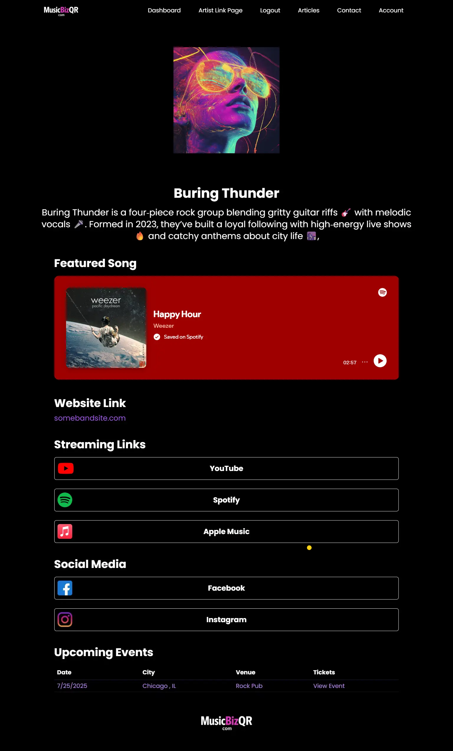
Visual hierarchy is how a page answers a question the fan never asks out loud: What matters first? Before a single click happens, the layout has already established an order of importance. That order determines whether attention flows forward or stalls in place.
Hierarchy works because it replaces decision-making. When one element clearly dominates — through size, contrast, placement, or spacing — the brain doesn’t need to evaluate options. It simply follows the signal. When dominance is absent, the brain is forced into comparison mode, and momentum slows immediately.
This is why hierarchy isn’t a stylistic choice. It’s a behavioral one.
On a smart link page, hierarchy creates three distinct psychological zones:
Primary focus
The element that anchors attention and answers “what should I do now?”Secondary relevance
Actions that feel available but not urgent.Background context
Information that supports trust without demanding interaction.
When these zones are clear, fans move naturally. When they collapse into one another, fans hesitate. Equal-sized buttons, uniform colors, and evenly weighted sections may feel fair, but fairness isn’t how attention works. The brain is wired to seek dominance, not democracy.
What makes hierarchy powerful is that it feels neutral to the fan. Nothing is explicitly being pushed. No instruction is given. The page simply feels obvious. That sense of obviousness is what musicians often mistake for simplicity, when in reality it’s the result of intentional emphasis.
Hierarchy also communicates confidence. Pages that clearly prioritize one action feel like they know what they’re for. Pages that present everything as equally important feel uncertain — as if they’re asking the fan to decide what the artist couldn’t. Fans respond to that uncertainty by disengaging, not by choosing carefully.
This is why hierarchy sits at the intersection of design and strategy. It’s not just about what looks good — it’s about what advances the journey. As explored in Why Every Indie Band Needs a Smart Link Strategy, smart links function best when they operate as intentional systems, not neutral directories. Hierarchy is the mechanism that makes that system legible.
When hierarchy is done well, the fan doesn’t feel guided — they feel relieved. The page has already decided what matters, and that decision frees attention to continue instead of evaluate.
The Psychology of Spacing and White Space
Spacing is one of the most misunderstood elements of smart link design because it feels passive. Nothing is added. Nothing is said. And yet, spacing communicates more about confidence and trust than almost any other visual choice.
White space isn’t empty space — it’s cognitive breathing room.
When elements are tightly packed, the brain interprets urgency. When space is generous, the brain interprets control. Fans may not consciously notice spacing, but they feel its effects immediately. Calm layouts invite exploration. Crowded layouts signal demand.
This matters because attention is fragile. When a page feels dense, the brain prepares for effort. It tightens focus, limits exploration, and looks for an exit. When a page feels spacious, the brain relaxes. It becomes more willing to linger, scroll, and engage without feeling pressured.
Spacing performs three psychological functions simultaneously:
It slows the eye
Space creates pauses between elements, allowing attention to settle instead of darting.It establishes importance
Elements surrounded by space feel intentional and valuable, not promotional.It signals confidence
Pages that don’t rush to fill every inch feel assured in their purpose.
This is why pages that look “minimal” often outperform pages that look “complete.” Completeness feels like obligation. Restraint feels like choice. Fans are far more willing to continue when the page doesn’t appear to demand their full attention all at once.
Spacing also affects perceived quality. Just as luxury environments use space to imply value, well-spaced smart link pages feel considered rather than opportunistic. Fans subconsciously associate that restraint with credibility. The band feels established, not desperate for clicks.
Crucially, spacing isn’t about removing depth — it’s about timing. Depth still exists, but it waits until attention is ready for it. When content is revealed gradually through scroll and structure, engagement feels earned rather than imposed.
This principle connects directly to fan journey design. As explored in Music Links for Artists: Build a Better Fan Funnel, reducing friction early makes deeper engagement easier later. Spacing is one of the most effective ways to lower that early resistance without saying a word.
When spacing is intentional, the page doesn’t feel empty. It feels composed. And composition is what turns curiosity into trust — quietly, without explanation.
Why Equal Elements Confuse Attention
Equality feels fair, but fairness is not how attention works.
When a smart link page presents multiple elements with equal size, color, and emphasis, it sends an unintended message: nothing here knows what matters most. The fan is left to resolve that uncertainty themselves, and the moment evaluation begins, momentum slows.
The brain is not designed to treat options democratically. It looks for signals of priority. When those signals are absent, it switches into comparison mode. Comparison is mentally expensive, and when the cost feels higher than the reward, attention disengages.
This is why pages filled with uniform buttons, evenly weighted sections, and identical visual treatments often underperform. On the surface, they look organized. In practice, they create friction. Every action competes with every other action, and the fan hesitates because choosing one means ignoring the rest.
Equal emphasis produces three predictable behaviors:
Scanning without committing
Fans move their eyes across the page but don’t settle long enough to engage deeply.Shallow interaction
A few exploratory clicks happen, but nothing accumulates into momentum.Quiet exit
The fan leaves without feeling rejected — simply undecided.
What makes this especially deceptive is that equality often feels artist-friendly. It avoids favoritism. It avoids judgment. It avoids hard choices. But design that avoids judgment transfers that burden to the fan — and fans rarely thank a page for making them decide.
Hierarchy doesn’t remove choice. It delays it. By establishing a clear first step, the page earns the right to offer secondary options later. When everything is presented at once, nothing feels safe to choose.
This distinction matters because smart link pages are not catalogs. They’re transitional spaces. Their job is not to represent everything equally, but to move attention forward smoothly. When elements are weighted intentionally, fans feel guided. When elements are equalized, fans feel stalled.
Conversion improves when pages stop trying to be fair and start being clear. Clarity reduces effort. Reduced effort keeps attention alive. And attention that stays alive is the foundation of every meaningful interaction that follows.
Contrast, Size, and Emphasis as Behavioral Signals
Contrast, size, and emphasis are not decorative tools — they are instructional signals. They tell the brain where to look, what to care about, and what can be safely ignored. Long before a fan understands why something stands out, their attention has already moved toward it.
Contrast works because the brain is wired to detect difference. Elements that break visual patterns are interpreted as important. Larger elements feel more consequential. Bolder elements feel more immediate. These reactions happen automatically, without conscious deliberation.
On a smart link page, these signals quietly shape behavior.
When emphasis is used intentionally, the page feels legible. The fan understands what matters now and what can wait. When emphasis is overused — multiple bold colors, oversized buttons, competing highlights — the signal collapses. The brain can’t determine priority, and attention fragments instead of focusing.
This is why “make it pop” is often bad advice. Popping everything flattens hierarchy. Emphasis only works when it’s scarce. One dominant element can guide attention effortlessly. Five dominant elements create noise.
Contrast, size, and emphasis also communicate confidence. Pages that highlight one clear action imply certainty. Pages that highlight everything imply indecision. Fans interpret that indecision as risk — not because the content is weak, but because the page doesn’t seem to know what it’s for.
There’s also a trust component. Excessive emphasis can feel manipulative, even when the intent is benign. Overly aggressive buttons, repeated visual calls to action, and constant visual urgency create resistance. The fan senses pressure before persuasion ever occurs.
Effective smart link pages use emphasis the way good writing uses punctuation — sparingly, deliberately, and only when meaning would be lost without it. Contrast clarifies. Size prioritizes. Emphasis signals relevance. Together, they reduce interpretation and keep attention moving forward without force.
When these signals are balanced, fans don’t feel directed. They feel oriented. The page becomes easier to read, easier to trust, and easier to continue through — which is exactly what conversion depends on.
Familiarity, Pattern Recognition, and Safety
Familiarity is one of the strongest trust signals a smart link page can offer — not because fans want boredom, but because the brain values predictability when deciding whether to continue. Before a fan engages deeply, their mind is scanning for signs that the environment is understandable and safe.
This happens through pattern recognition.
When a layout follows recognizable structures — clear top-to-bottom flow, predictable placement of primary actions, consistent spacing — the brain relaxes. It doesn’t need to learn the interface before engaging with the content. Familiarity reduces uncertainty, and reduced uncertainty preserves attention.
This is why radically novel layouts often underperform early in the journey. Novelty demands interpretation. Interpretation costs effort. And effort, when not yet justified by trust, triggers withdrawal. Fans don’t consciously think “this layout is confusing” — they simply feel a subtle resistance to continuing.
Familiarity doesn’t mean copying templates. It means respecting how people expect information to be organized. Patterns act like visual grammar. When grammar is followed, meaning flows. When grammar is broken too early, comprehension stalls.
Safety signals emerge from this predictability:
Known structures feel trustworthy
Fans are more willing to explore when they don’t have to learn how the page works.Consistency builds confidence
Repeated visual logic reassures the brain that effort won’t be wasted.Expectation alignment reduces friction
When actions appear where fans expect them, hesitation disappears.
What makes this especially important for smart link pages is repetition. These pages aren’t always visited once. They’re often revisited across campaigns, posts, QR scans, and offline moments. Familiarity compounds. Each return visit feels easier than the last, which quietly increases engagement over time.
This is where layout psychology intersects with branding. A smart link page that feels consistent and recognizable becomes part of the artist’s identity — not just a utility. As explored in Beyond the Bio Link: How Smart Links Are Changing Artist Branding Forever, stable destinations build trust by becoming familiar surfaces fans learn to rely on.
The goal isn’t to impress. It’s to reassure. When a page feels familiar, the brain stops scanning for exits and starts engaging with what’s in front of it. And engagement only happens when the environment feels safe enough to stay.
Design That Guides Without Pushing
The most effective smart link pages don’t feel persuasive. They don’t urge, pressure, or instruct. Instead, they guide quietly — by making the next step feel obvious rather than demanded.
This distinction matters because attention tightens under pressure. When fans sense they’re being pushed toward an outcome, resistance appears immediately. Even subtle signals of urgency can trigger hesitation if trust hasn’t already formed. Guidance, on the other hand, feels supportive. It removes uncertainty without imposing intent.
Design achieves this through implication, not instruction.
A well-structured page doesn’t tell the fan what to do. It simply makes one action feel like the natural continuation of the moment that brought them there. Nothing competes. Nothing shouts. The fan moves forward because it feels easier than stopping.
This is why layout often outperforms copy as a conversion tool. Words can persuade, but structure can relieve. When the page answers unspoken questions — Where do I start? What happens next? Is this worth my time? — the fan doesn’t feel sold to. They feel oriented.
Guidance without pressure shows up in subtle ways:
Clear visual starting points
One dominant action signals where attention should settle first.Unforced progression
Secondary options remain visible without demanding engagement.Absence of urgency cues
No visual countdowns, no repeated prompts, no aggressive emphasis.
When these elements align, the page feels calm and confident. Calm pages don’t rush attention — they retain it. Fans are more likely to explore when nothing feels like a trap or commitment.
This approach connects directly to system-level smart link strategy. As explored in Smart Links for Musicians: How to Turn One Link into a Marketing Powerhouse, smart links perform best when they act as steady, reusable infrastructure rather than high-pressure landing pages.
Design that guides without pushing creates space for trust to develop. And trust, once established, carries attention forward far more reliably than persuasion ever could.
When Design Psychology Breaks Down
Design psychology doesn’t fail because the principles stop working — it fails because they’re overridden by competing priorities. Most breakdowns happen when a smart link page is designed to express something instead of to guide someone.
The most common failure mode is overcompensation.
When artists feel pressure to look professional, impressive, or complete, design becomes expressive rather than functional. Branding grows louder. Features stack up. Visual elements multiply. Each addition may make sense in isolation, but together they overwhelm the very mechanisms that support attention.
Breakdowns tend to follow a few predictable patterns.
Over-branding replaces orientation
Heavy logos, dominant color treatments, and aggressive visual identity can drown out hierarchy. The page becomes about being seen rather than being navigated. Fans notice the brand, but lose the path.
Feature-first layouts prioritize capability over behavior
Embeds, widgets, and platform links are surfaced because they exist — not because the fan is ready for them. The page explains what’s possible instead of shaping what’s next.
Aesthetic consistency overrides emphasis
Everything is styled to match, which feels cohesive but eliminates priority. When design consistency becomes more important than behavioral clarity, hierarchy collapses.
Artist logic replaces fan logic
What feels meaningful to the creator often feels premature to the visitor. Pages are organized around effort and pride rather than attention and readiness.
What makes these breakdowns dangerous is that they don’t look broken. Pages still load. Links still work. Analytics still show visits. The failure is behavioral, not technical. Attention arrives but doesn’t accumulate.
Another subtle breakdown happens when design tries to solve strategic problems. No amount of polish can compensate for unclear intent. When the page itself doesn’t know what it’s trying to move attention toward, design signals become contradictory. Fans sense that uncertainty immediately.
This is why design psychology can’t be applied mechanically. It has to serve a clear job. Layout only works when it reinforces purpose. Without that alignment, even well-executed design principles cancel each other out.
When smart link pages stop converting, the solution is rarely more design. It’s usually less interference. Removing what competes, quieting what distracts, and restoring clarity to what leads.
Design psychology breaks down when expression overtakes guidance. It recovers when the page returns to its role: reducing effort, signaling priority, and letting attention move forward without resistance.
How Design Psychology Supports Continuation
Continuation is the quiet goal underlying every effective smart link page. It’s not about finishing an action or closing a loop — it’s about keeping attention alive long enough for trust, familiarity, and meaning to accumulate. Design psychology plays a central role in whether that continuation feels natural or forced.
When layout aligns with how the brain processes information, the page stops feeling transactional. It feels open-ended. Fans don’t sense a deadline or an expectation to decide; they sense permission to stay, explore, and return later. That permission is what allows engagement to compound over time.
Design supports continuation by avoiding visual “end states.”
Pages that emphasize completion — hard stops, dominant single-use actions, or visually collapsed sections after interaction — signal finality. Once the action is taken, the page feels resolved. Fans subconsciously register that resolution and disengage. Even if nothing explicitly ends, the layout implies closure.
Continuation-focused design does the opposite. It keeps the page feeling explorable after every interaction. No matter where the fan clicks, the environment still feels relevant. Attention isn’t funneled toward a finish line; it’s allowed to circulate.
This shows up in several structural ways:
Open hierarchy instead of terminal emphasis
Primary actions lead attention without visually exhausting it.Persistent context
The page still feels coherent and welcoming after interaction.Absence of visual urgency
Nothing suggests that the moment will expire if the fan doesn’t act now.
Psychologically, this matters because pressure collapses curiosity. Fans are far more likely to engage deeply when they don’t feel evaluated or rushed. Continuation thrives in environments that feel patient and available.
This principle connects directly back to smart link strategy as infrastructure. As discussed in How to Build a Smart Link Page That Actually Converts Fans, conversion improves when pages are designed to support movement rather than outcomes. Design psychology ensures that movement doesn’t feel like a demand — it feels like an invitation.
When layout supports continuation, smart link pages stop behaving like landing pages and start behaving like places. Fans don’t just pass through them; they return. And return visits are where momentum compounds quietly, without persuasion, without friction, and without pressure.
Frequently Asked Questions
Why does layout matter more than content on a smart link page?
Layout determines how content is perceived before it’s understood. Fans react instinctively to structure, spacing, and hierarchy first. If the page feels overwhelming or unclear, strong content often goes unseen.
What is visual hierarchy in the context of smart link pages?
Visual hierarchy is how a page signals priority. Through size, contrast, placement, and spacing, it tells fans what matters now, what can wait, and what’s supporting context — reducing the need to decide.
How does cognitive load affect fan behavior?
High cognitive load makes interaction feel mentally expensive. When a page forces comparison or interpretation too early, fans hesitate or leave. Lowering cognitive load keeps curiosity alive long enough for engagement to build.
Why do equal-sized buttons and sections hurt conversion?
Equal emphasis removes priority cues. When everything looks equally important, fans are forced to evaluate options instead of following a clear path — which increases hesitation and stalls momentum.
Is white space really that important?
Yes. White space provides cognitive breathing room. It slows the eye, reduces pressure, and communicates confidence. Pages with intentional spacing feel calmer and more trustworthy.
Can strong calls to action replace good layout?
No. Calls to action add pressure, while layout removes uncertainty. Smart link pages convert best when structure guides behavior without relying on persuasion.
Should smart link pages be minimal or detailed?
They should be layered. Minimal at first glance, with depth revealed as attention grows. The goal isn’t less content — it’s better timing.
How does design psychology support repeat visits?
Familiar layouts and consistent structure reduce effort on return visits. Each interaction feels easier than the last, which increases long-term engagement.
What’s the most common design mistake musicians make?
Designing to express everything at once instead of guiding attention. Pages built around artist logic often overwhelm fans before trust is established.
Do smart link pages need to change for releases or tours?
They should adapt in emphasis, not reset in structure. Familiar destinations build trust; contextual prioritization keeps them relevant.
Built for Musicians. Powered by Smart Links.
MusicBizQR gives you a powerful landing page with streaming links, videos, social buttons, and real-time fan analytics — all from a single QR code.
- 🎯 Unlimited link clicks & analytics
- 📈 Track Spotify streams, YouTube plays, and QR scans
- 📱 Mobile-optimized artist pages
- 🚀 Create your first Smart Link in seconds
Related Posts
Most link-in-bio tools weren’t built for musicians. Discover why smart links create better fan journeys, stronger branding, and higher conversions for your music.
Smart links for musicians explained—how they work, why they matter in 2026, and how to build a fan-converting link that drives your music career.
Discover how music links can help artists guide fans across platforms effortlessly. Learn strategies to boost engagement, streams, and merch sales.
Most link-in-bio tools weren’t designed for musicians. Learn why smart links deliver better fan engagement, stronger branding, and real music-driven revenue.
Smart links aren’t just utility tools — they’re the new frontier in artist branding. Learn how visual design, consistency, and fan-centric smart links define a musician’s digital identity.
Discover how smart links can transform fleeting music streams into lasting fan connections. Learn the strategies indie artists use to grow their audience in the streaming era.
Discover how smart links empower indie artists to create deeper, lasting relationships with fans. Turn every click into meaningful engagement.
Discover 2026’s best smart link tools for artists. We compare top platforms, fan engagement features, and why MusicBizQR stands above the rest.
Learn how direct-to-fan video turns your smart link into a conversion machine. Build trust, drive streams, and make real fan connections with MusicBizQR.
Learn how to use music links to drive fan engagement, increase streams, and promote your music like a pro. Built for modern artists and bands. Shall I begin writing the Markdown content for this article now?
In 2026, discovery is chaotic — and smart links are how artists bring it all together. Explore how music smart links guide fans, boost streams, and create real momentum across every platform.
Tired of generic link tools? Discover the smart link platform built for music: video previews, analytics, and full artist control—all in one sleek page.
Every new release deserves more than a link in your bio. Learn how to use smart links to drive streams, collect fans, and turn a single drop into lasting momentum.
The layout of your smart link page can make or break your fan engagement. Learn the design psychology that turns clicks into superfans.
If you're still sending fans to scattered links, you're leaving money on the table. Here's why every indie artist needs a smart link strategy to grow, connect, and convert.",
Most smart links just sit there. This guide shows musicians how to build a smart link page that turns casual clicks into lifelong fans. Real strategies that work.
Discover the psychology behind smart link layout design and how it shapes fan engagement, conversions, and merch sales.
Master the art of launching music with smart links. This guide shows how to create hype, drive streams, and maximize impact every time you drop a new release.
Your smart link is your new homepage. Learn how to design a 2026-ready page that plays your music instantly, tells your story, and converts fans the moment they land.
Learn how musicians can use smart links to connect directly with fans, bypass algorithms, and drive engagement, streams, and merch sales.
Discover how embedded content like music, videos, and social posts can turn your smart link into a fan engagement engine. Boost streams, merch sales, and loyalty.
Discover why smart links are transforming music marketing in 2025. Learn how a centralized hub can grow your audience, boost streams, and drive real fan engagement.
From Spotify embeds to merch and tour links, MusicBizQR makes music promotion easy. Learn how to use smart links to streamline your entire fan funnel.
Learn five powerful ways smart links can revolutionize your band's music promotion, amplify fan engagement, and strengthen fan loyalty.
Discover how smart links are revolutionizing music promotion, increasing fan engagement, boosting streaming numbers, and enhancing concert attendance.