Choosing the Right Landing Page for Your QR Campaigns
How to Choose the Perfect Landing Page for Your QR Campaigns
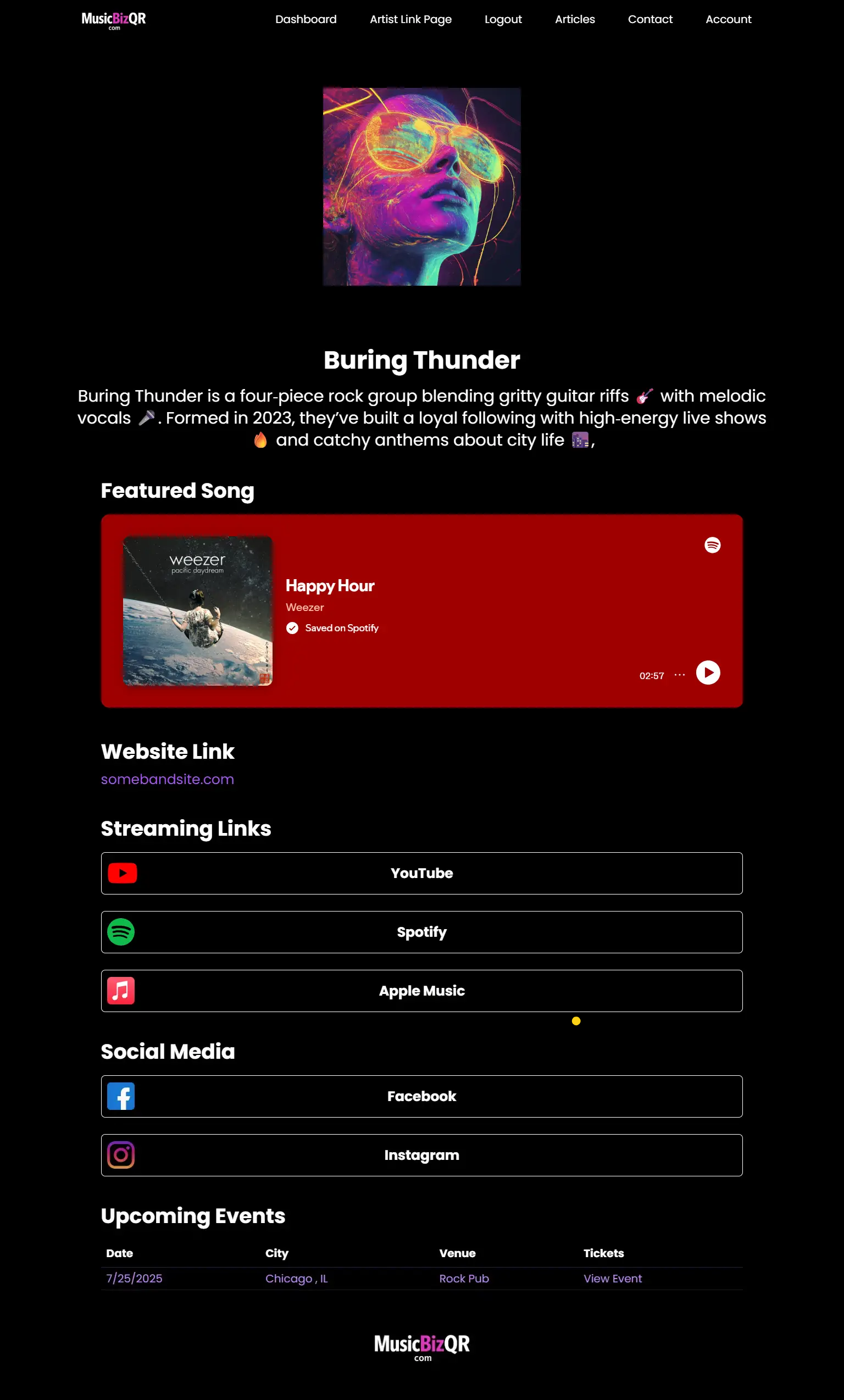
She scanned the poster at the edge of the venue’s merch table, braced by the roar of the crowd. Within a heartbeat, her phone loaded a sleek mobile page: a full‑screen album art carousel, a single “Pre‑save Now” button glowing in neon pink, and a tiny “Learn more” link below. She tapped once—and moments later, her playlist featured the band’s latest single. No distractions. No extra taps. Just that instant spark of connection.
That seamless moment is the hallmark of a well‑crafted QR landing page—a moment every musician wants to deliver. But too often, artists slap a generic homepage behind their codes, only to watch fans click away or get lost in irrelevant content. A QR campaign’s success lives or dies on the landing page. It must feel bespoke, urgent, and laser‑focused on the action you care about most.
In this 2,000‑word deep dive, you’ll journey through real‑world stories, discover the psychology of mobile behavior, and learn how to tailor landing pages that turn curious scans into lasting fan relationships.
Chapter 1: The Psychology of the First Tap
Imagine you’re Maya again—standing in a sweltering festival field, phone in hand, ready to scan. Her expectations are simple:
- Instant gratification. The page must load in under two seconds.
- Single‑minded clarity. One option above the fold: pre‑save, sign up, buy merch.
- Emotional resonance. The visuals and copy should mirror the energy of the moment.
That mental checklist happens in milliseconds. If her initial tap yields a generic homepage with ten menu items and a blog feed, she’s out. The landing page is your one chance to capitalize on peak excitement. Nail it, and you build both trust and momentum in a single scroll.
Chapter 2: Defining Your Conversion Event
Before you design a single pixel, pick the one action that matters most:
- Pre‑save or stream: Perfect for new releases or album drops.
- Mailing‑list signup: Ideal for collecting fan contact info ahead of a tour.
- Merch or ticket sale: Best for on‑tour or pop‑up shop campaigns.
- Exclusive content unlock: Video teasers, behind‑the‑scenes clips, or early access tracks.
Consider the saga of electro‑punk band Neon Frequencies. During their spring tour, they distributed flyers with dynamic QR codes that directed fans to a pre‑save page. The landing page featured only a “Pre‑save on Spotify” button and a countdown timer to release day. They captured 1,200 pre‑saves in just three shows—and converted 35% of those fans into their mailing list with a post‑pre‑save prompt. By choosing a single conversion event, they avoided dilution and maximized impact.
Action Step: Articulate your primary conversion goal in one clear sentence—then let every design choice reinforce it.
Chapter 3: Mobile‑First Design Principles
Since over 90% of QR scans occur on phones, your landing page must behave like an app:
- Minimal chrome: Hide navigation bars, banners, or side menus until after the conversion.
- Thumb‑reachable CTAs: Position buttons within the bottom third of the screen for easy one‑hand taps.
- Fast load times: Compress images, defer non‑critical JavaScript, and use a reliable CDN.
When dream‑pop artist Luminous Drift rolled out her new single, her team discovered that a full‑screen background video on the landing page was delaying load times by three seconds. After swapping to a lightweight animated GIF for the hero, load times halved—and conversion rates jumped by 22%.
Chapter 4: Tailoring Content to Your Audience
A landing page for a college radio promo differs drastically from one at a packed festival. Context is everything:
- Festival crowd: Bold imagery, live performance clips, “Join us tonight” CTAs.
- Email subscribers: Personalized greeting, subscriber‑only perks, “Thanks for being here” microcopy.
- Record‑store drop: Highlight limited‑edition vinyl, “Only 50 copies” scarcity messaging.
Consider how folk singer River Moss segmented her landing pages by scan source. She embedded unique dynamic QR codes in street‑team postcards, each pointing to a slightly different page: one version emphasized her backstory for coffee‑shop audiences, another offered a discount code for local record stores. This hyper‑targeting drove a 40% lift in engagement compared to a one‑size‑fits‑all page.
Chapter 5: Hero Section That Hooks
Your above‑the‑fold hero is showtime. It needs three elements:
- Eye‑catching visual: Album art, live photo, or custom illustration.
- Concise headline: “Pre‑save ‘Starlight’ now” or “Get your free backstage pass.”
- Primary button: Bold, thumb‑sized, high‑contrast “Pre‑save” or “Join Mailing List.”
Story Example
When synthwave duo Electric Sundays launched their EP, they ran two hero variants in an A/B test:
- Variant A: Full-width hero image + “Stream Now” button + “Learn More” link.
- Variant B: Simplified hero with just “Pre‑save on Spotify” button.
Variant B won by 30%—proof that reducing choices above the fold amplifies clicks.
Chapter 6: Crafting Persuasive Microcopy
Every word counts when you have a thumb‑tap environment. Avoid generic verbs like “Submit.” Instead:
- Use action‑oriented labels: “Pre‑save on Spotify,” “Unlock VIP Access,” “Claim Your Free Track.”
- Leverage urgency or exclusivity: “Limited‑time offer,” “Only 100 vinyl codes available.”
- Add social proof: “Join 10,000 fans who’ve already pre‑saved.”
In the middle of her epic landing page, indie‑pop artist Ava Grey slipped a one‑line testimonial: “I pre‑saved ‘Midnight Sun’ and got an early demo—so good!” That tiny social proof nugget boosted her click‑through rates by 12%.
Chapter 7: The Role of Supporting Elements
Once the hero does its job, you can layer in secondary content—but sparingly:
- Countdown timers: Drive excitement for release or tour start.
- Feature highlights: One‑sentence blurbs (“Exclusive behind‑the‑scenes video,” “Signed vinyl giveaway”).
- Secondary CTAs: “Follow on Instagram,” “Share with a friend.”
But remember: every element added above the fold dilutes focus. Test each new component in isolation to ensure it lifts, rather than lowers, conversions.
Chapter 8: Imagery & Media That Convert
Visual storytelling makes your landing page feel like an extension of the show:
- Short looping videos (10–15 sec): Showcase a live performance snippet.
- Animated GIFs: Preview a merch item spinning on a turntable.
- Background gradients or textures: Tie into your brand palette without overpowering legibility.
Singer‑songwriter Mira Lane embedded a 10‑second clip of her latest music video on her landing page. Conversion rates for her “Watch full video” button exceeded 45%, compared to a plain image hero that tested at only 28%.
Chapter 9: Trust Signals & Social Proof
Fans want reassurance they’re in the right place. Sprinkle in trust signals:
- Press quotes: “Voted Best New Artist by IndieWave Magazine.”
- Logos: Festival badges, Spotify editorial playlist icons.
- Fan counts: “Join 5,000 fans who’ve already pre‑saved.”
When EDM producer SkyShock added a row of five festival logos where his tracks had premiered, his landing‑page conversions climbed 18%—proof that familiar badges build confidence.
Chapter 10: Post‑Conversion Flow
Don’t vanish after the click. Your post‑conversion journey cements the relationship:
- Thank‑you overlay: Instant confirmation—“Thanks for pre‑saving! Click to explore merch.”
- Next steps: Offer a bonus—“Share this with a friend for exclusive remix access.”
- Follow‑ups: Send a scheduled email or SMS to keep fans engaged until release day.
Case in point: Pop‑punk trio The Fast Lanes used a thank‑you popup to invite fans to their private Discord server immediately after signup. Within 24 hours, their Discord grew by 300 members—and many of those went on to become superfans at shows.
Chapter 11: Testing & Iteration
Even the best landing page benefits from data‑driven tweaks:
- A/B test one variable at a time: Button text, hero image, headline phrasing.
- Measure mobile vs. desktop behavior: Sometimes desktop visitors behave differently—tailor URLs accordingly.
- Rotate dynamic codes across different designs and compare performance in MusicBizQR’s analytics dashboard.
When synth‑pop duo Lunar Allure swapped their button from “Pre‑save” to “Get Early Access,” they saw a 16% lift—simple wording changes can yield big results.
Chapter 12: Scaling Across Campaigns
Once you perfect one landing page, clone the framework:
- Tour dates promo: Swap hero to “RSVP for X City,” embed local venue image, change CTA to “Get free ticket upgrade.”
- Merch upsell: Feature product photo, CTA “Claim 20% off your first shirt.”
- Post‑show follow‑up: Create an event‑specific page with show photos and “Share your review” CTA.
By reusing your proven template and simply swapping assets and copy, you’ll maintain consistency while meeting each campaign’s unique goal.
Chapter 13: Future Trends in QR Landing Experiences
The horizon of QR landing pages is expanding:
- Interactive webs: Mini‑games unlocked via QR scans to engage fans before they hear your song.
- AI‑driven personalization: Landing pages that adapt copy and CTAs based on time of day, location, or device type.
- Web3 integrations: NFT minting directly through a scanned landing page.
Artists like Nova Circuit are already piloting AI‑personalized landing experiences—scans in Tokyo prompt a unique greeting in Japanese, while scans in Berlin showcase local gig recommendations.
Chapter 14: Your Blueprint for Launch
- Define your single conversion goal. Write it on a sticky note above your desk.
- Draft a hero experience: Hero image, headline, primary button, mobile‑first layout.
- Gather trust signals and testimonials. Keep them tight—one or two max above the fold.
- Build and test: Launch two variants simultaneously—hero A vs. hero B.
- Analyze and iterate weekly. Convert learnings into fresh tests.
Your QR code is only as powerful as the experience that follows. By choosing the right landing page—one that feels fast, focused, and familiar—you turn every scan into an opportunity to grow your fanbase, boost your streams, and cement your place in your listeners’ playlists.
Ready to deploy your first custom QR landing page? Sign up at MusicBizQR.com/signup and start converting curiosity into fandom today.
Built for Musicians. Powered by Smart Links.
MusicBizQR gives you a powerful landing page with streaming links, videos, social buttons, and real-time fan analytics — all from a single QR code.
- 🎯 Unlimited link clicks & analytics
- 📈 Track Spotify streams, YouTube plays, and QR scans
- 📱 Mobile-optimized artist pages
- 🚀 Create your first Smart Link in seconds
Related Posts
Discover the art and science of crafting QR codes that scan flawlessly every time—from sizing and contrast to placement and branding. This in‑depth guide walks musicians through each step with real‑world stories and expert tips.
Discover how bands can use QR code marketing to grow their fanbase, boost engagement, and increase revenue with real-world strategies and examples.
Get more scans at shows. Exact sizes, contrast, distances, and placements for QR codes on posters, stage screens, and merch—battle-tested.
Dynamic QR codes let artists edit links, track scans, and grow fan funnels—without reprinting. Here’s why every musician should use them (and how).
Learn how indie bands can boost merch sales at live shows using QR codes. Engage fans, simplify purchases, and track what works—all with MusicBizQR.
Discover how QR codes are helping musicians grow their audience, boost engagement, and drive merch and ticket sales in 2025.
Learn how musicians are using QR codes to collect email addresses from fans during concerts and tours. Build your fanbase with smarter tech.
Discover how artists are using QR codes at live shows to turn fleeting moments into lasting fan relationships and revenue.
Learn how musicians use QR codes to grow fans, sell merch, promote tours, and build owned audiences in 2026. A complete, modern QR code strategy guide.
Discover how musicians are using QR codes to grow their fanbase, sell more merch, and promote shows. Learn why QR is the most underrated tool in music marketing.
Discover how to craft landing pages that turn every QR code scan into streams, signups, or sales. Learn narrative‑driven best practices, real‑world examples, and pro tips for mobile‑first experiences that engage and convert.
Discover how a thoughtful QR strategy can transform fan engagement, drive traffic to your music, and unlock new revenue streams for independent artists. Learn best practices and real‐world examples to build your own QR roadmap.
Discover how musicians are using QR codes to turn festival sets and tour stops into major fan growth engines. Real-world tactics that convert.
Learn how musicians can use QR codes at live shows to drive fan engagement, stream growth, and merch sales. Step-by-step tactics that actually work.
Discover the story of how an unknown indie band used QR codes and smart fan engagement to grow their audience and turn local shows into viral momentum.
Discover how QR codes are helping artists grow their fanbase, boost streams, and drive merch and ticket sales. Learn how to use QR codes to build your music career.
Discover how QR codes are revolutionizing music marketing, empowering bands and artists to engage fans, drive streams, and increase revenue.
Learn how QR codes are revolutionizing music discovery, making it easier for fans to connect instantly with new bands, content, and experiences.
How QR Codes Are Redefining Music Promotion for Indie Artists
Explore how QR codes are transforming the music industry's gig economy by empowering independent artists to connect, monetize, and grow without middlemen.
Discover how musicians are using QR codes at live shows to build long-term fan relationships. Learn proven strategies that turn casual listeners into superfans.
Learn how to design and deploy a high-converting QR code campaign for your next album drop. Includes tips on branding, analytics, and maximizing engagement.
Learn how indie musicians can use QR codes strategically to generate income, boost merch sales, and create lasting connections with fans.
Discover how bands can turn every live show into a powerful fan engagement moment using QR codes. Learn tactics that convert concertgoers into lifelong fans.
Discover how bands and solo artists can use QR codes to supercharge tour promotion, grow their fanbase, and drive ticket sales with ease.